City Logo, Crest and Flag
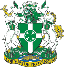 Symbolism of the Coat of Arms
Shield of Arms
The core of the design is a new symbol in Canadian heraldry developed from the idea of "The Green Heart of British Columbia". The heart is shown four times, oriented to the four cardinal directions representing all the directions in the community. The hearts are framed in a green circle to underline the idea of Chilliwack being at the heart of things. The hearts are placed at the centre of two paths, giving rise to the second theme, Chilliwack as the crossroads of the Upper Fraser Valley.
Crest (above the Shield)
The helmet and mantling, the decorative cloth in the City's colours of green and white (heraldic silver) are the two traditional components of this and most coats of arms. Today they can symbolize, in the same spirit as the knight defending his lands, the determination of citizens to safeguard and strengthen their community. Above the helmet and mantling is a special emblem, the mural coronet, often used in heraldry to represent municipal government. It carries a frieze of maple leaves and dog woods to represent a Canadian municipality in British Columbia.
Supporters & Compartment
The compartment on which the shield rests and the supporters stand represents symbolically, the farmlands, forested land and waters of the municipality. The First Peoples of the community are honoured through the golden salmon, rendered in Salish style. Agricultural pioneers and the agricultural industry are also highlighted through the two silver plows. The supporter on the left side is a stag representing the rich wildlife to the City. On the right is a mare, symbol of the horsepower which was the motive force for all of Chilliwack's early agricultural development and other types of early transport and industry as well. Each supporter has a distinctive collar and pendant. The pentagon symbolizes the "five corners" of the original settlement while the corn represents all of the crops which make "The Green Heart of the Province" so well known.
Motto
COR VIRIDE PROVINCIAE - "The Green Heart of the Province".
Flag
The City’s motto is “COR VIRIDE PROVINCIAE”, which is Latin for “the green heart of the province”, in reference to our agricultural roots, and our flag represents this concept. In the early 1990s, the (then) District of Chilliwack applied to the Canadian Heraldic Authority for the grant of a flag. According to the Public Register of Arms, Flags and Badges of Canada, the City of Chilliwack flag is an original concept of Robert D. Watt, Chief Herald of Canada, assisted by the heralds of the Canadian Heraldic Authority. Our current flag was granted to the (then) District in October 1993. Elements of our Shield of Arms were used in the design of our flag.
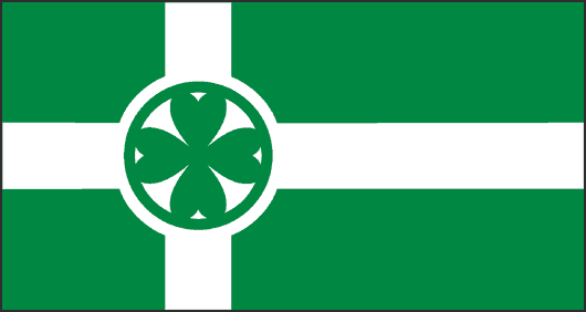
City of Chilliwack Flag
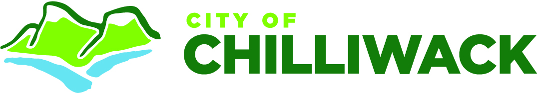
City of Chilliwack Logo
In 2011, Council approved a new logo and graphic standards for the City of Chilliwack. The logo and guidelines are used for the majority of City documents, correspondence, publications and signage. The Chilliwack crest continues to be used on documentation that exercises Council’s statutory authority.
To develop a new logo, a working group comprised of City staff, as well as representation from Chilliwack Economic Partners and Tourism Chilliwack was formed in July, 2010 to begin the initial concept for a logo. The group chose a Chilliwack company, ‘Basecamp Creative’ to develop the logo design work. Six logo concepts were narrowed down to two by the working group and were presented to City Directors and Administration, who selected the logo in its current form.
The logo design is intended to reflect an image which is modern, friendly and efficient. The focal point of the new logo is Mt. Cheam, which depicts a well-known landmark using contemporary colour schemes and design elements. This mountain range denotes Chilliwack as a stable and sold community. The water features below represent the Vedder and Fraser rivers, two major water systems that flow through the Chilliwack area and remain significant components of the City’s character and economy.
Rivers are also a symbol of grace and fluidity and epitomize Chilliwack’s relaxed ‘go with the flow’ personality. Blue conveys stability and calm, while the two shades of green in the logo signify Chilliwack’s diverse agriculture industry. Green is seen extensively in nature and so it is representative of Chilliwack’s defining characteristic, the beauty of its natural surroundings.
| Attachments | |||
| Description | Date | File Size | |
 |
TIF version of the City Logo | 2020-10-19 | 194KB |
 |
EPS version of the City Flag | 2003-08-11 | 133KB |
 |
GIF version of the City Flag | 2003-08-11 | 4KB |
|
TIF version of the City Flag | 2003-08-11 | 726KB |